


Guffwatch - 'Three Urinals', a million bucks each
November 15 2014
Video: Christie's
This video is a classic example of the guffy genre, with Christie's cataloguing of Robert Gober's 'Three Urinals' (1988). It made $3.5m earlier in New York this week. If you thought the urinal idea was old hat, having been done before by Duchamp in 1917, then think again, because Gober's uniquely inspirational achievement is to, er, 'recontextualise' the meaning of the urinal. And as the catalogue entry breathlessly notes, Gober's really amazing achievement is that he actually made these urinals himself:
Unlike Duchamp, who made art of mass-produced objects, Gober takes the form of a factory produced object and reconstructs it by hand, thereby reasserting his (and by default) the artist’s hand in these objects.
[...]
Though the purity of its form is almost Minimalist in its reduction, the hand-made quality of Three Urinals contradicts its formal austerity and Minimal coolness. Meticulously crafted by the artist, this work is composed of the humblest materials—plaster, wire, wood and enamel paint—in striking contrast to its real-life porcelain counterpart. The smooth contours invite the viewer’s touch, and the sheen of all-white enamel perfectly mimics the cleanliness and rigor of porcelain. But the difference in encountering the warmth of plaster and wood versus the cold, unfeeling indifference of porcelain provides a striking contrast. It exudes the uncanny feeling that the Surrealists termed frisson—the unexpected, chill-producing effect that two seemingly illogical objects could produce when combined. Lined up at regulation height directly onto the surface of the wall, Three Urinals celebrates the prosaic nature of the objects they purport to mimic. Except, on closer examination, this striking triptych is far removed from the ubiquitous sanitary ware on which they are based. This object is resolutely handmade, carefully constructed with a human quality and reinforcing the artist’s search for meaning in form and content rather than the artworld stratergizing that is associated with Duchamp’s readymades.
There are four 'striking contrasts' or 'contradictions' in the above paragraph. In fact, the whole paragraph seems to contradict itself. Read the full catalogue text here.
Update - another typical guffy construction in the description of Christopher Wool's 'Fool',* with an early deployment in the catalogue note of one of our favourites here on AHN, the Pointlessly Contradictory Sentence:
At once refined and elegant in its Minimalist simplicity, the painting is quiet yet shouts by use of the large-scale black lettering that extends to the uttermost limits of the canvas edge.
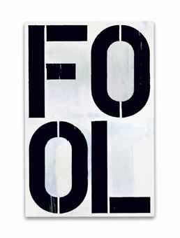
Can anybody tell me in what way the above painting is refined, elegant or quiet? It made $14m.
By the way, that's not just any old stenciled lettering we see here:
By breaking the words into their constituent letters and separating them out within a pictorial grid, Wool destabilizes the coherence of each word, thereby hinting at the fallibility of language itself. In the present work, he separates “FOOL” into “FO” and “OL,” so that the letters are prohibited from their descriptive role in forming words, and are left to exist simply as formal elements within a white field. This technique is especially potent considering the letter-count of “FOOL:” it contains four letters that fit so perfectly within Wool’s four quadrants, not unlike Indiana’s LOVE or Warhol’s early photo-booth self-portraits. Even the letters themselves are fractured by virtue of their stenciled nature; small slits cut into the stencil to allow for easier dissemination so that the “O” in “FOOL” is not a perfect circle, but bifurcated down the middle into two separate halves.
* Actually, officially the painting is called 'Untitled'.
